Start a conversation

Brand & Identity

Holistic Wellness Logofolio

Five identity routes showing how a holistic wellness brand can move from energetic to calm.

  • Brand direction
  • Logo design
  • Visual identity
  • Packaging design
The projectContext & approach

Five identity routes for one holistic wellness brief.

The Holistic Wellness Logofolio gathers five complete identity routes for a wellness and healthcare brief. Each route sets a different relationship between typography, symbol, colour and packaging, moving from vivid editorial geometry to calmer botanical linework, and each is resolved through campaign and product applications.

01Approach one: expressive colour and modular geometry
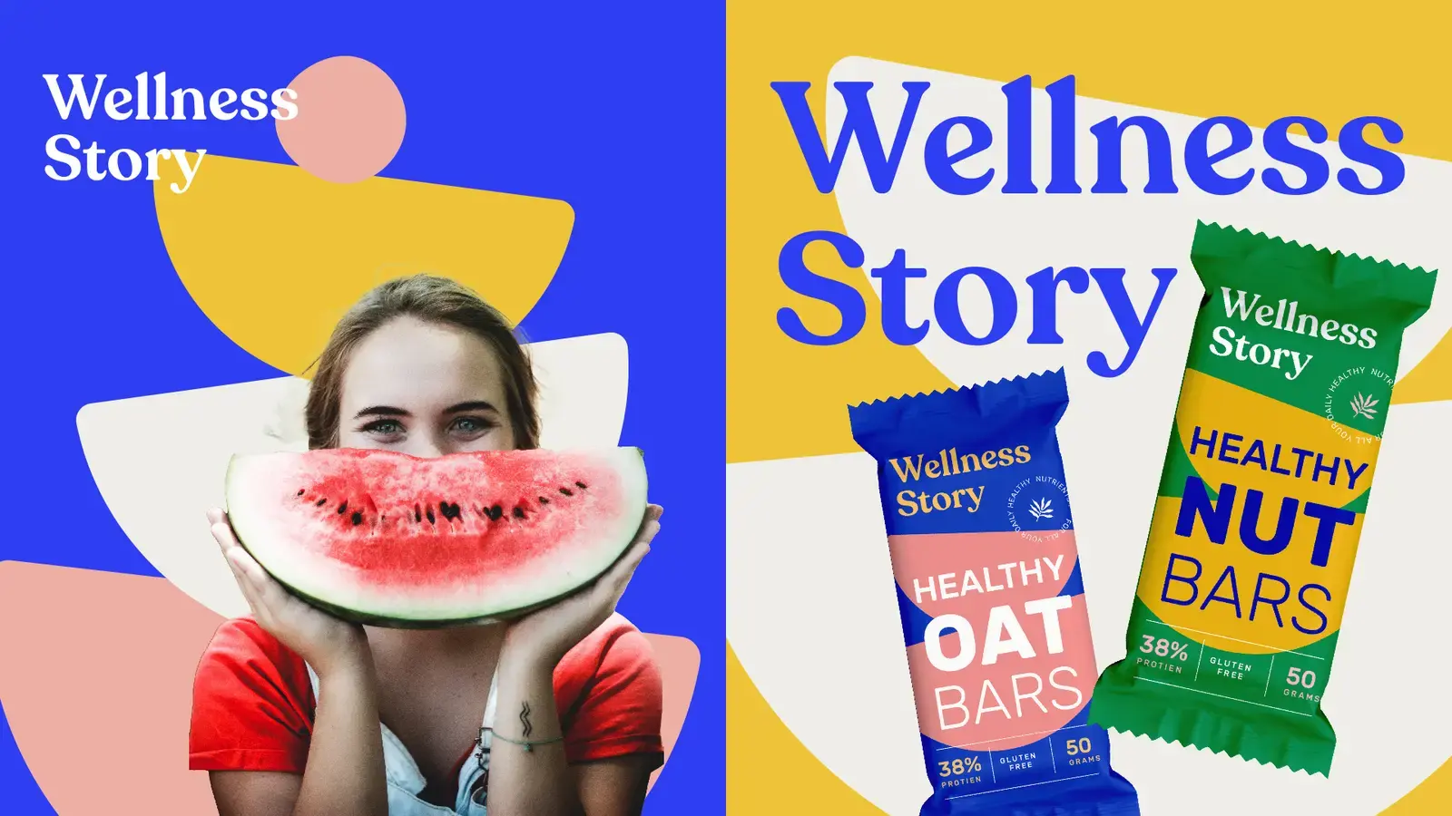
Wellness Story campaign with bright geometric shapes and a watermelon portrait
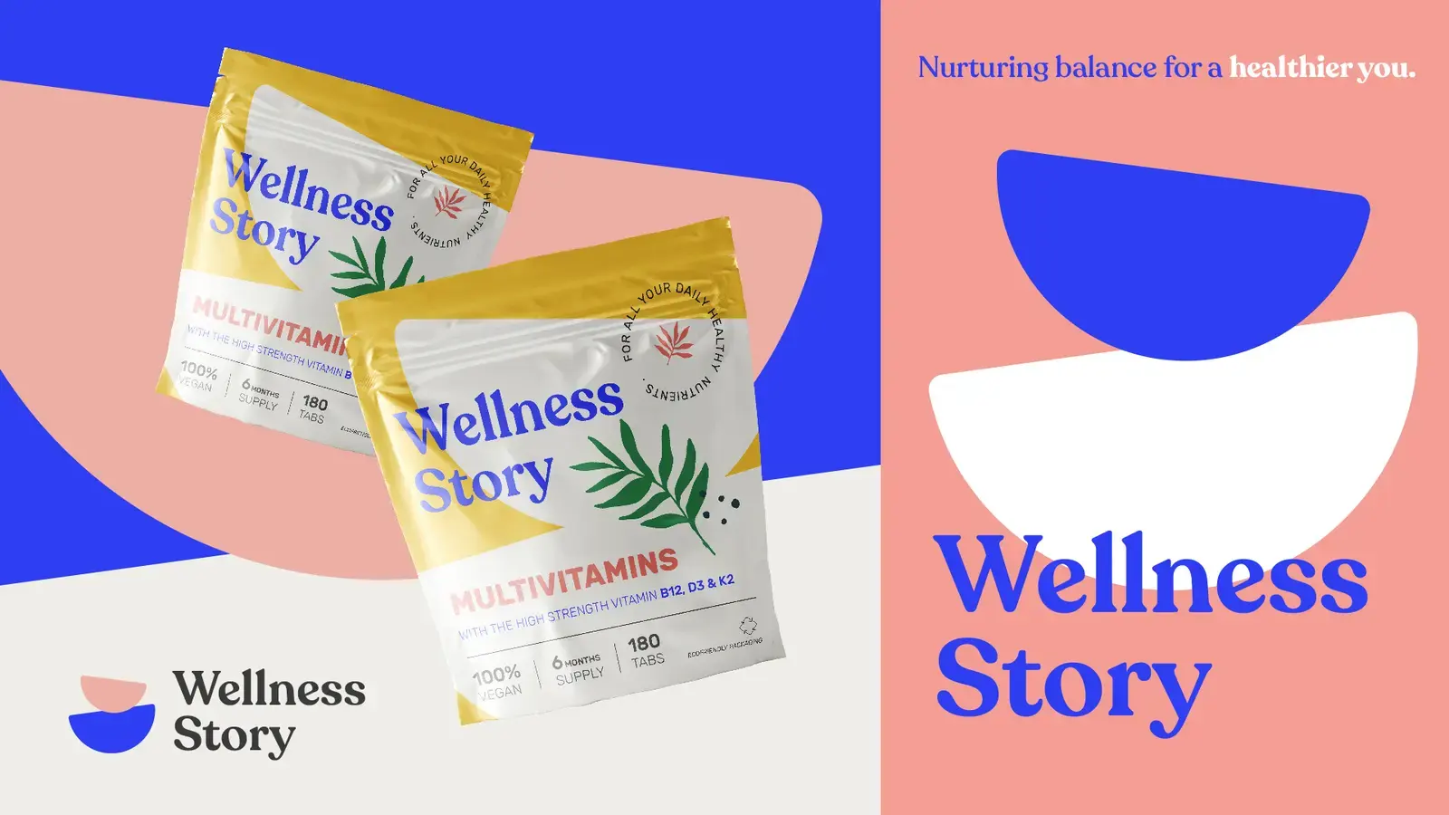
Wellness Story packaging in blue, pink and warm yellow
02Approach two: a composed symbol and deeper natural tones
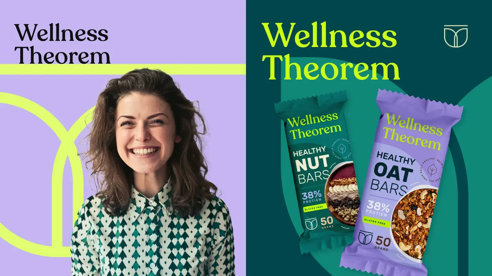
Wellness Theorem campaign in lilac, forest green and fluorescent yellow
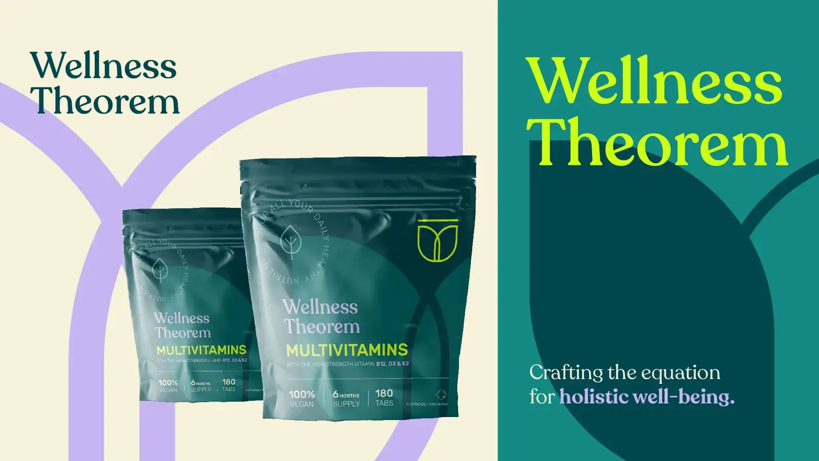
Wellness Theorem multivitamin packaging with a geometric emblem
03Approach three: botanical forms with a softer editorial voice
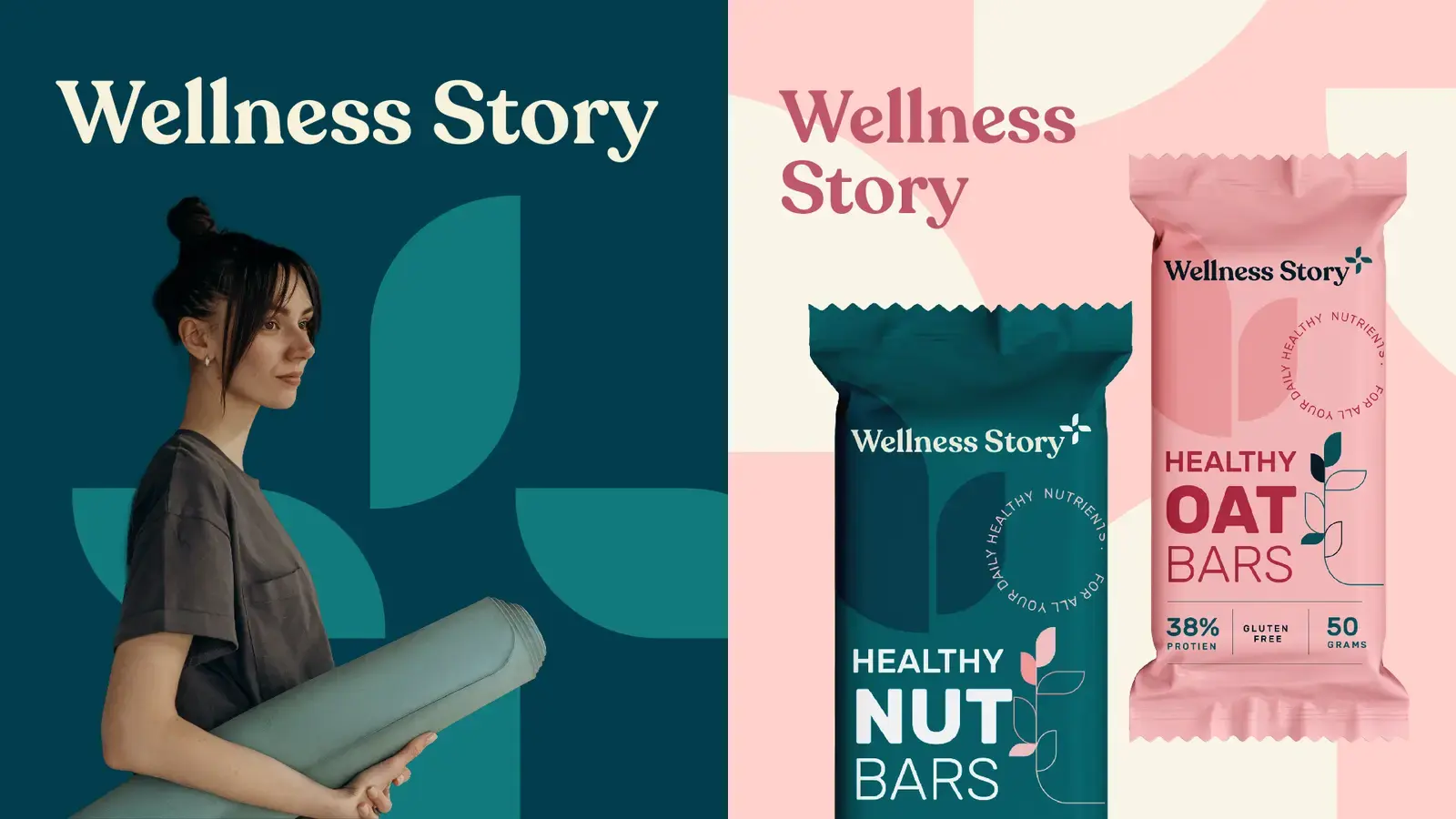
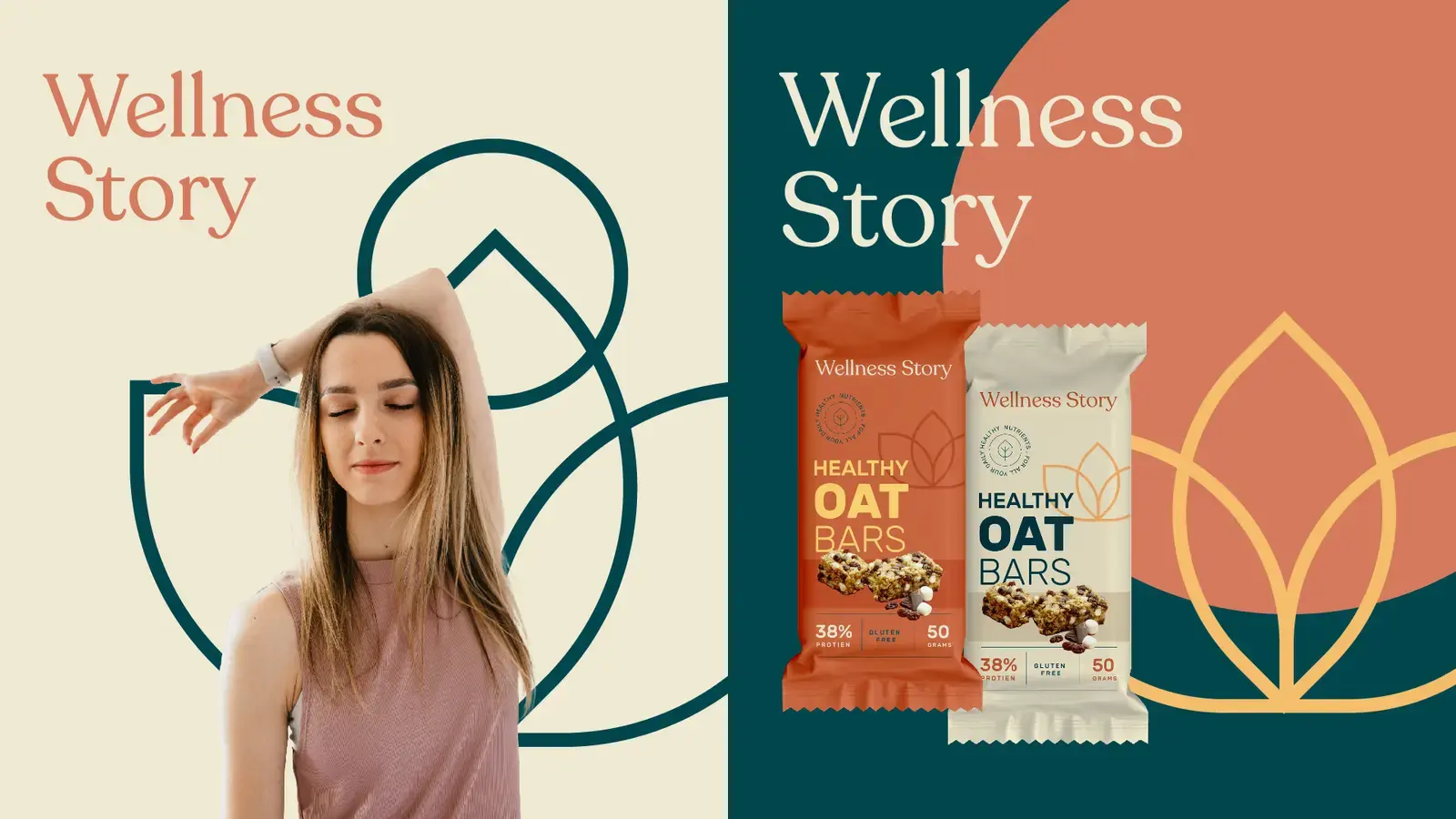
Wellness Story campaign with botanical shapes and oat-bar packaging
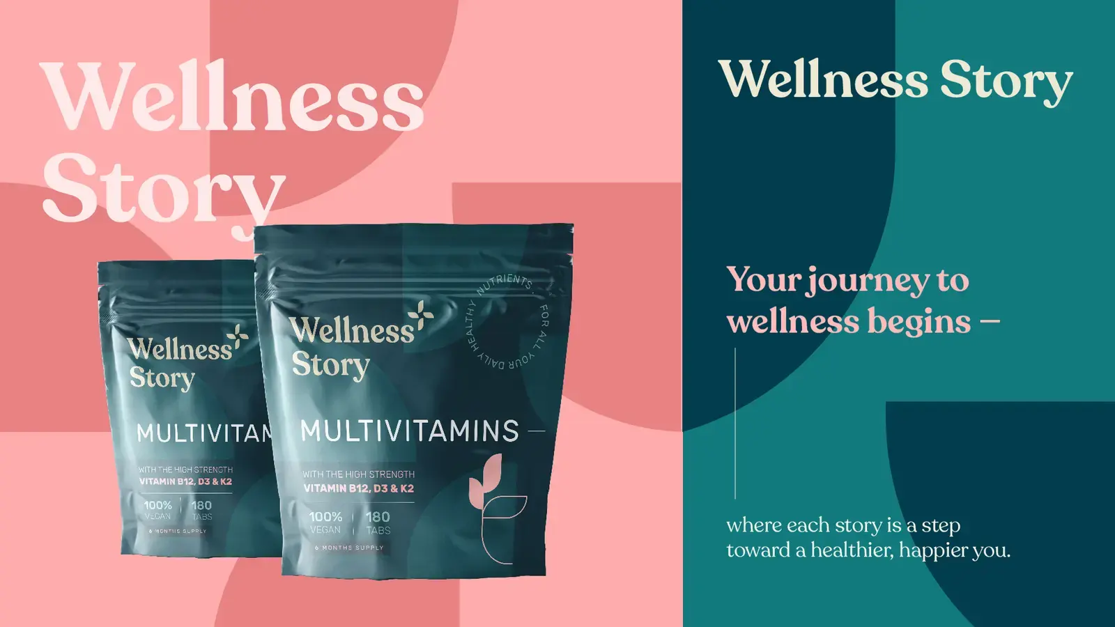
Wellness Story multivitamin packaging in coral, pink and deep teal
04Approach four: energetic shapes and a sharper digital rhythm
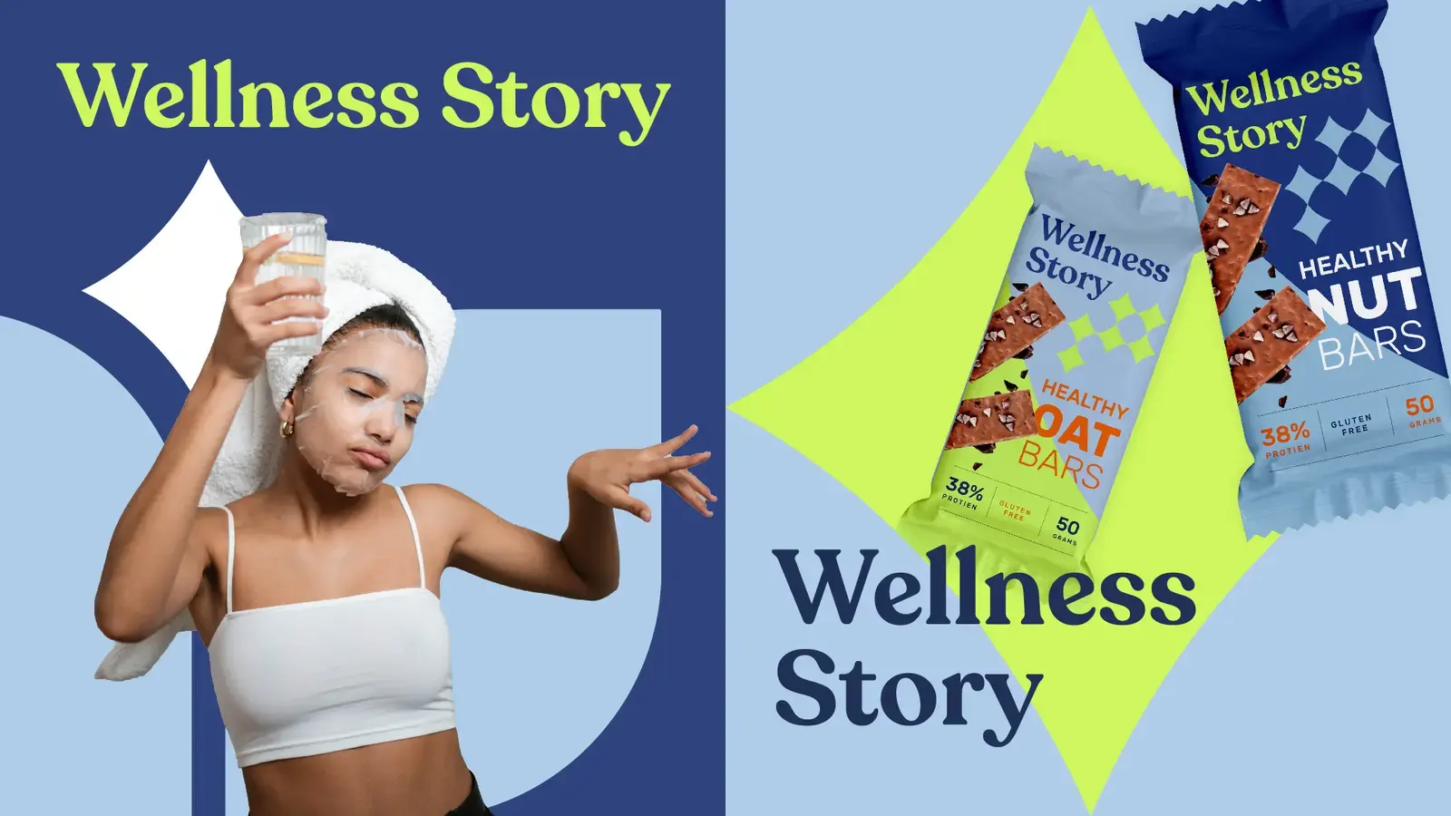
Wellness Story campaign with star forms, blue panels and snack packaging
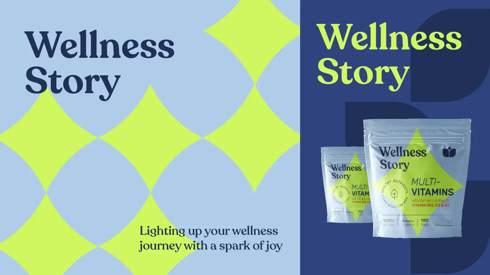
Wellness Story packaging with lime star shapes on pale blue
05Approach five: delicate linework and warm natural colour
Wellness Story campaign with abstract botanical linework and oat bars
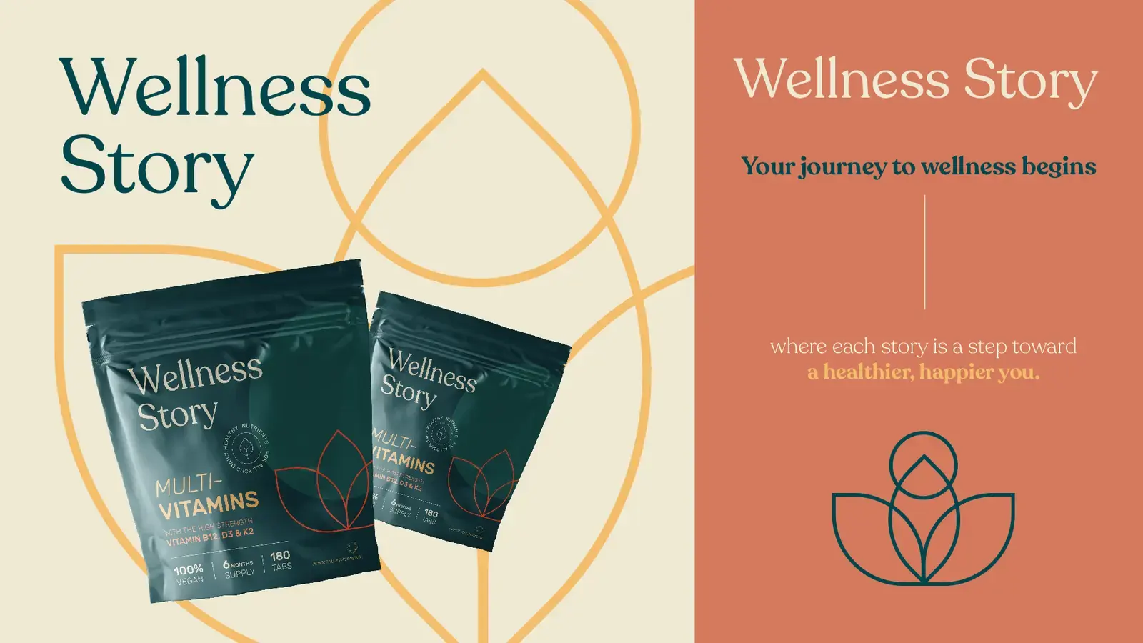
Wellness Story multivitamin packaging with fine botanical linework

KartenLabs / Contact

Tell us about your project.

We use these details only to reply to your enquiry, not for marketing. See our Privacy & Legal notice.