Start a conversation

Brand & Identity

De Soul Santé Hospitality

A hospitality identity pairing botanical forms, restrained typography and tactile guest touchpoints.

  • Brand direction
  • Visual identity
  • Print applications
The projectContext & approach

A quiet hospitality identity shaped around nature and care.

Created by KartenLabs in 2020, the De Soul Santé identity brings a calm botanical character to hospitality applications. Deep green, warm neutrals and a fine serif wordmark move across stationery, editorial pieces, guest amenities, uniforms and in-room details as one restrained visual language.

Year
2020
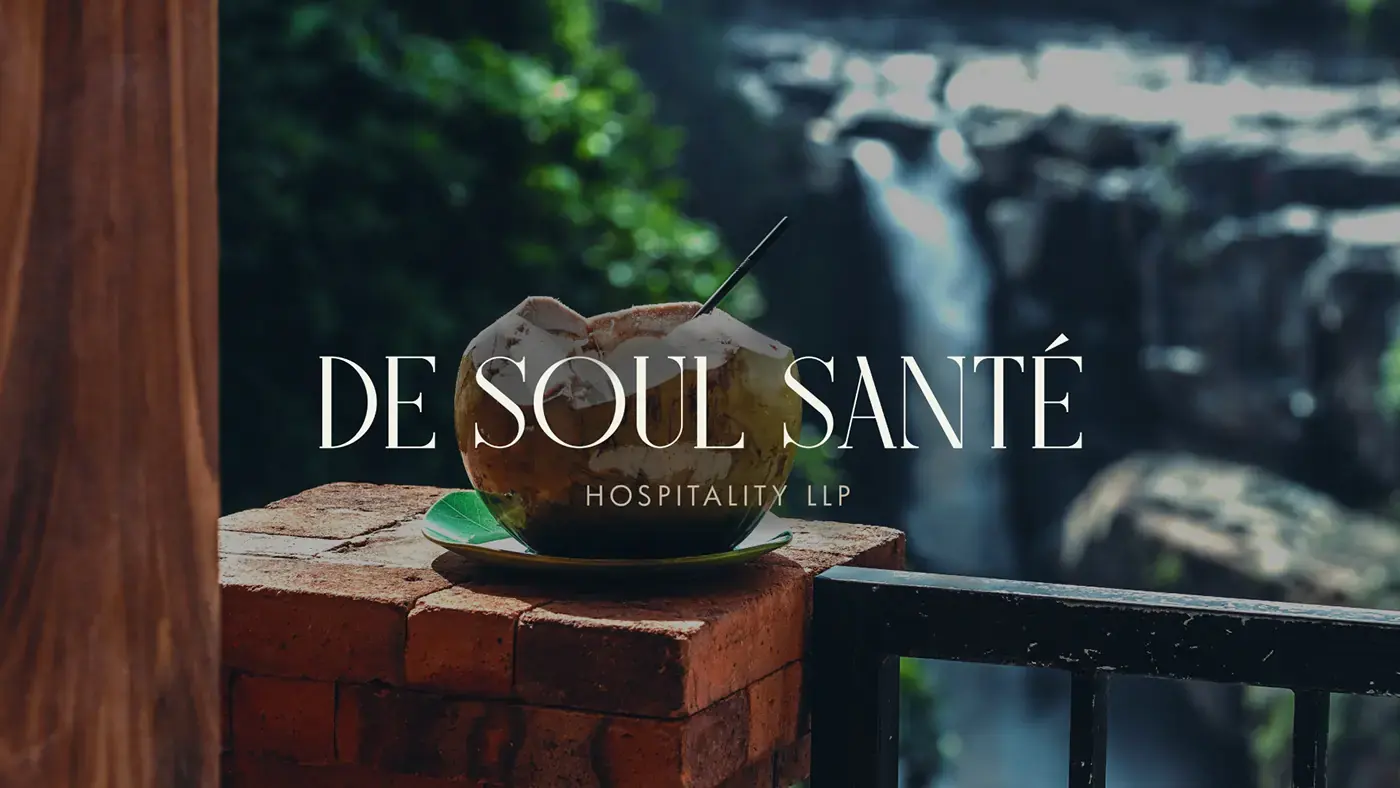
01A botanical identity with a quiet sense of place
De Soul Santé Hospitality wordmark over a lush resort landscapeDe Soul Santé wordmark and botanical emblem on a deep green surface
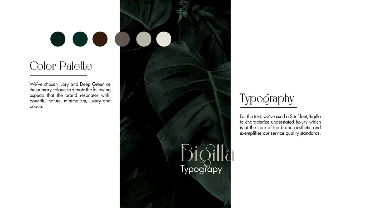
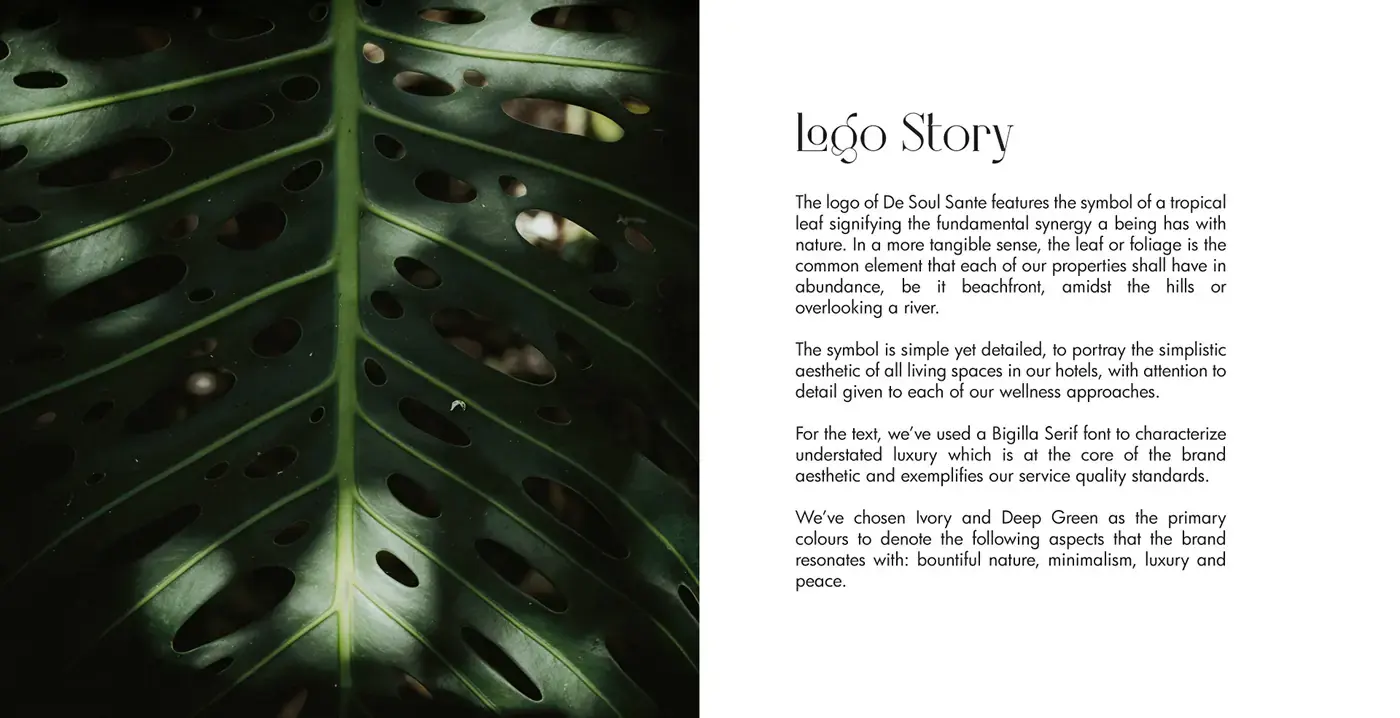
02A restrained palette, serif voice and botanical mark
De Soul Santé colour palette and typography presentationDe Soul Santé logo story beside a close-up tropical leaf
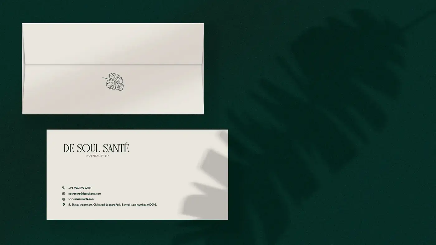
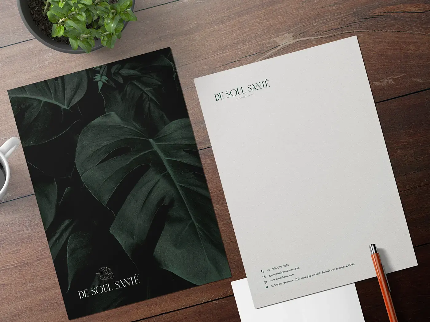
03Stationery shaped by generous space and natural texture
De Soul Santé envelope and business card on a deep green backgroundDe Soul Santé letterhead and botanical stationery on a wooden desk
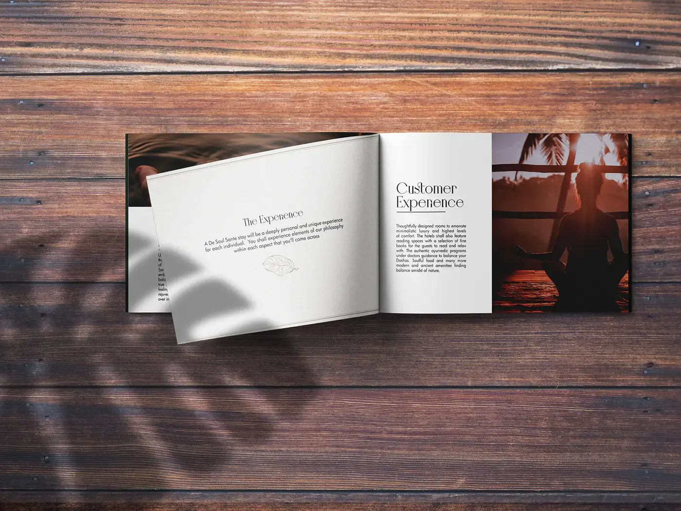
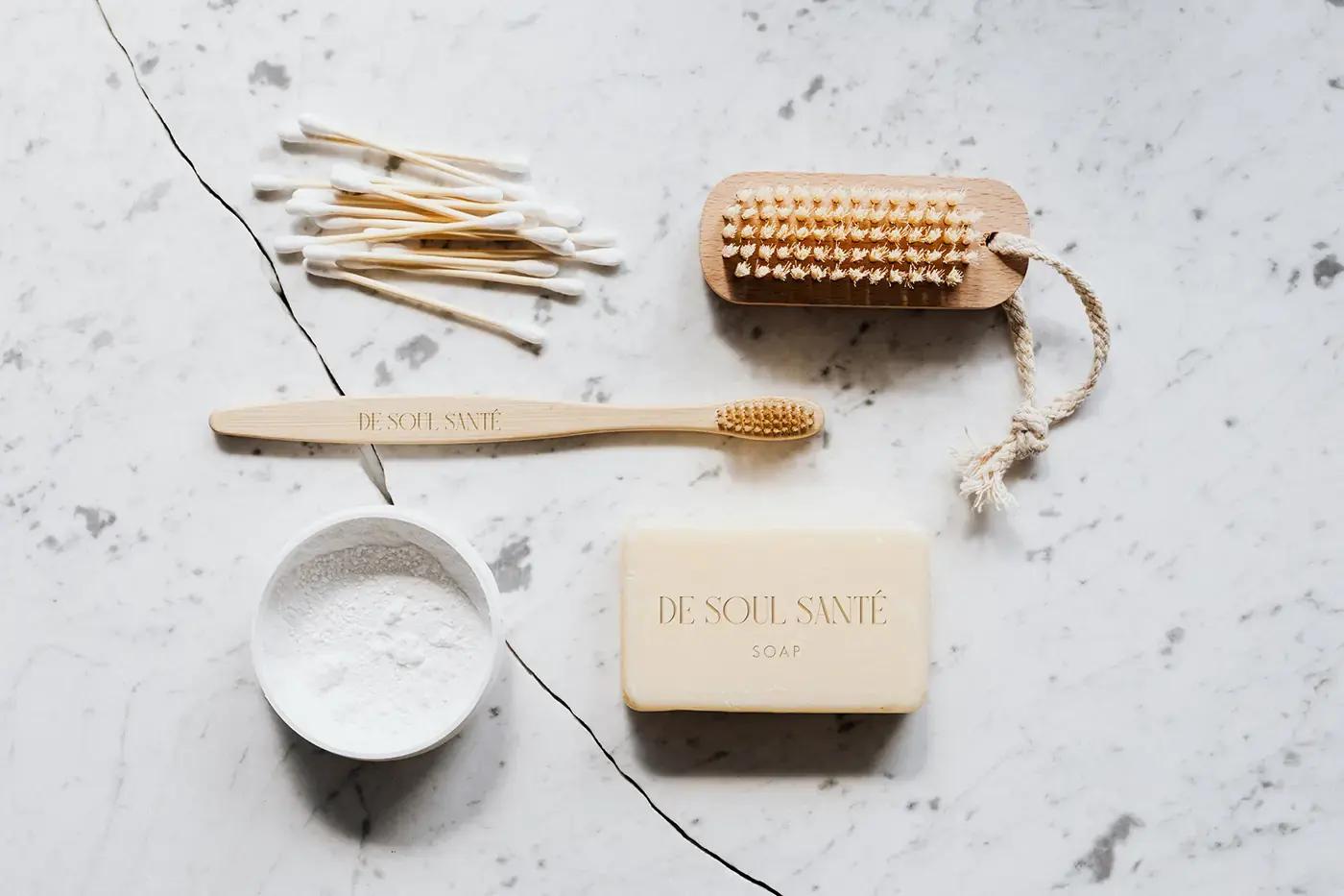
04Editorial and guest materials that extend the atmosphere
Open De Soul Santé hospitality brochure on a wooden tableDe Soul Santé guest amenities arranged on pale stone
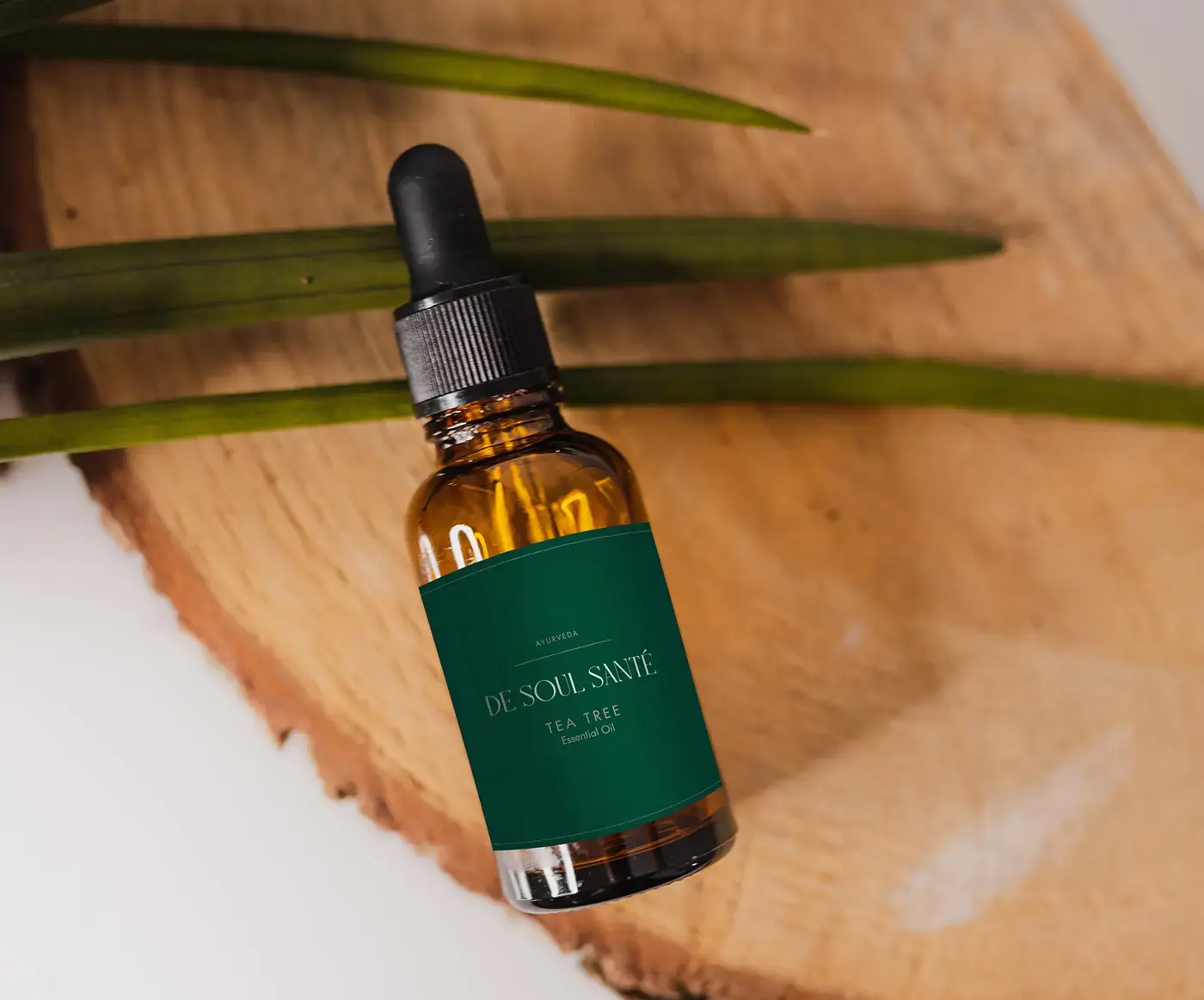
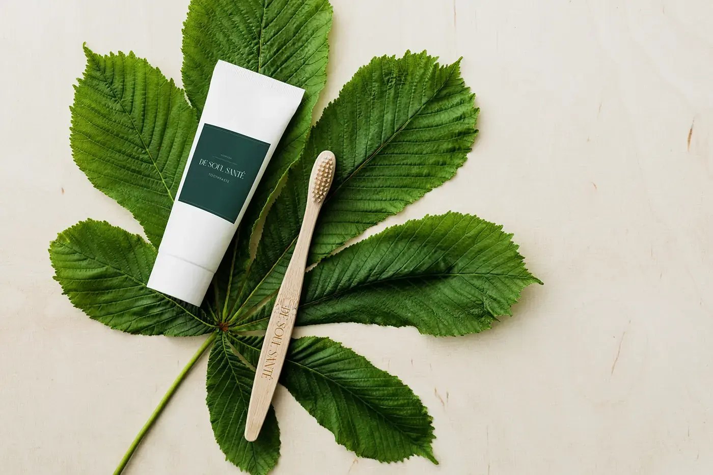
05The identity carried into treatment and room products
Amber treatment-oil bottle with a deep green De Soul Santé labelDe Soul Santé guest product and wooden brush arranged over green leaves
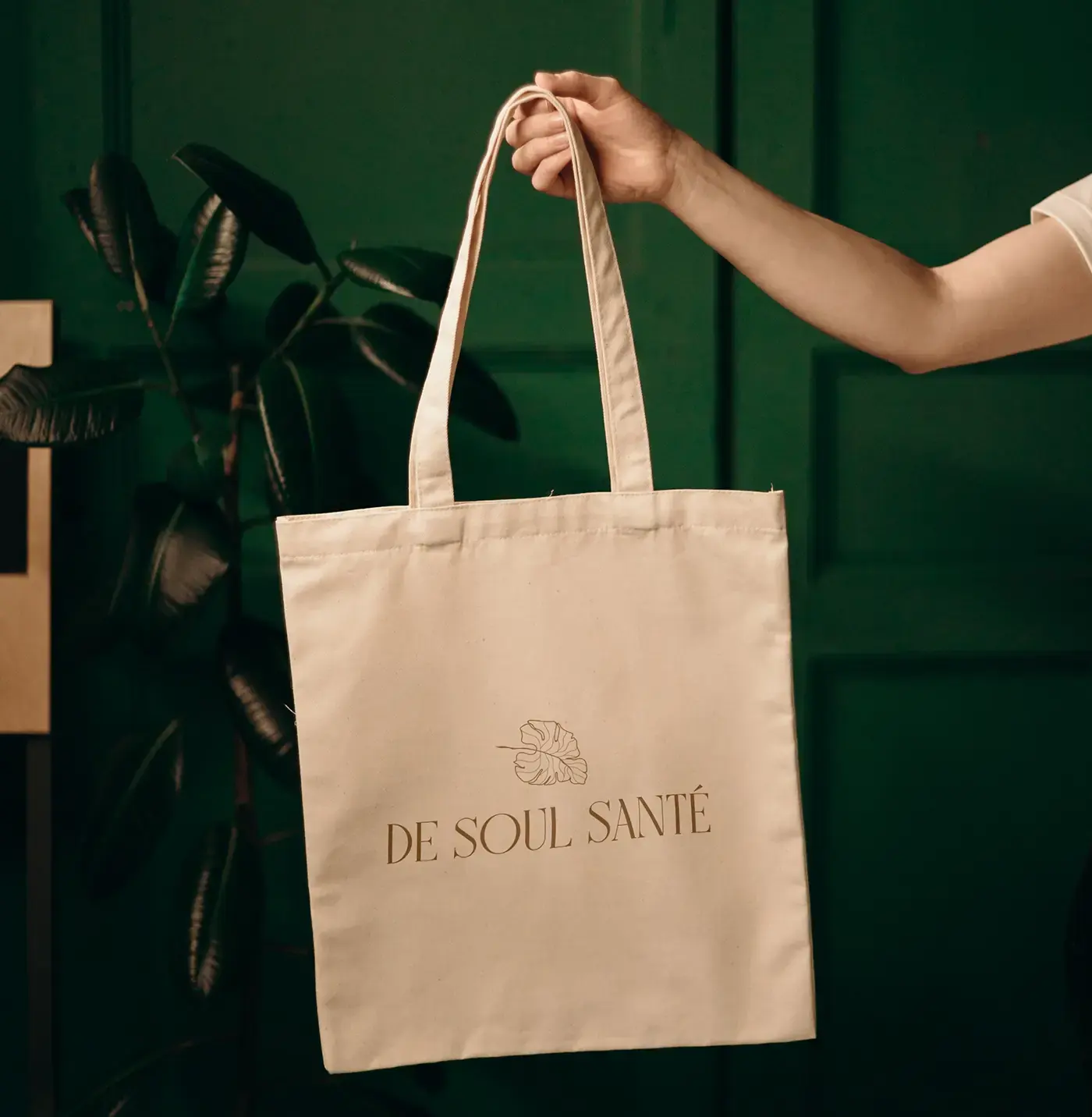
06A consistent presence across service and guest touchpoints
Hospitality staff wearing De Soul Santé green apronsNatural canvas tote printed with the De Soul Santé botanical mark
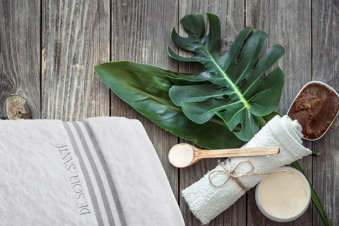
07The visual language continuing into the guest room
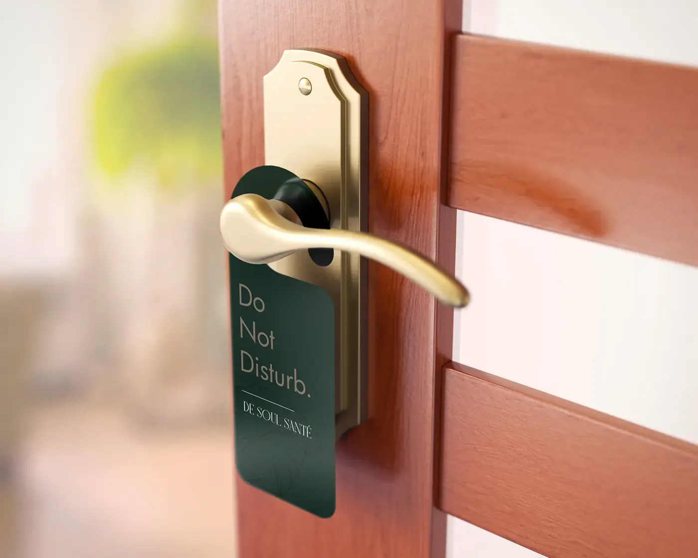
De Soul Santé embroidered towel with botanical spa accessoriesDeep green De Soul Santé do-not-disturb sign on a guest-room door

KartenLabs / Contact

Tell us about your project.

We use these details only to reply to your enquiry, not for marketing. See our Privacy & Legal notice.