Start a conversation

Brand & Identity

Ambika Industries

A hospitality identity extending a geometric emblem across stationery, service touchpoints and interiors.

  • Brand redesign
  • Visual identity
  • Hospitality applications
The projectContext & approach

A composed hospitality identity designed to move through every guest touchpoint.

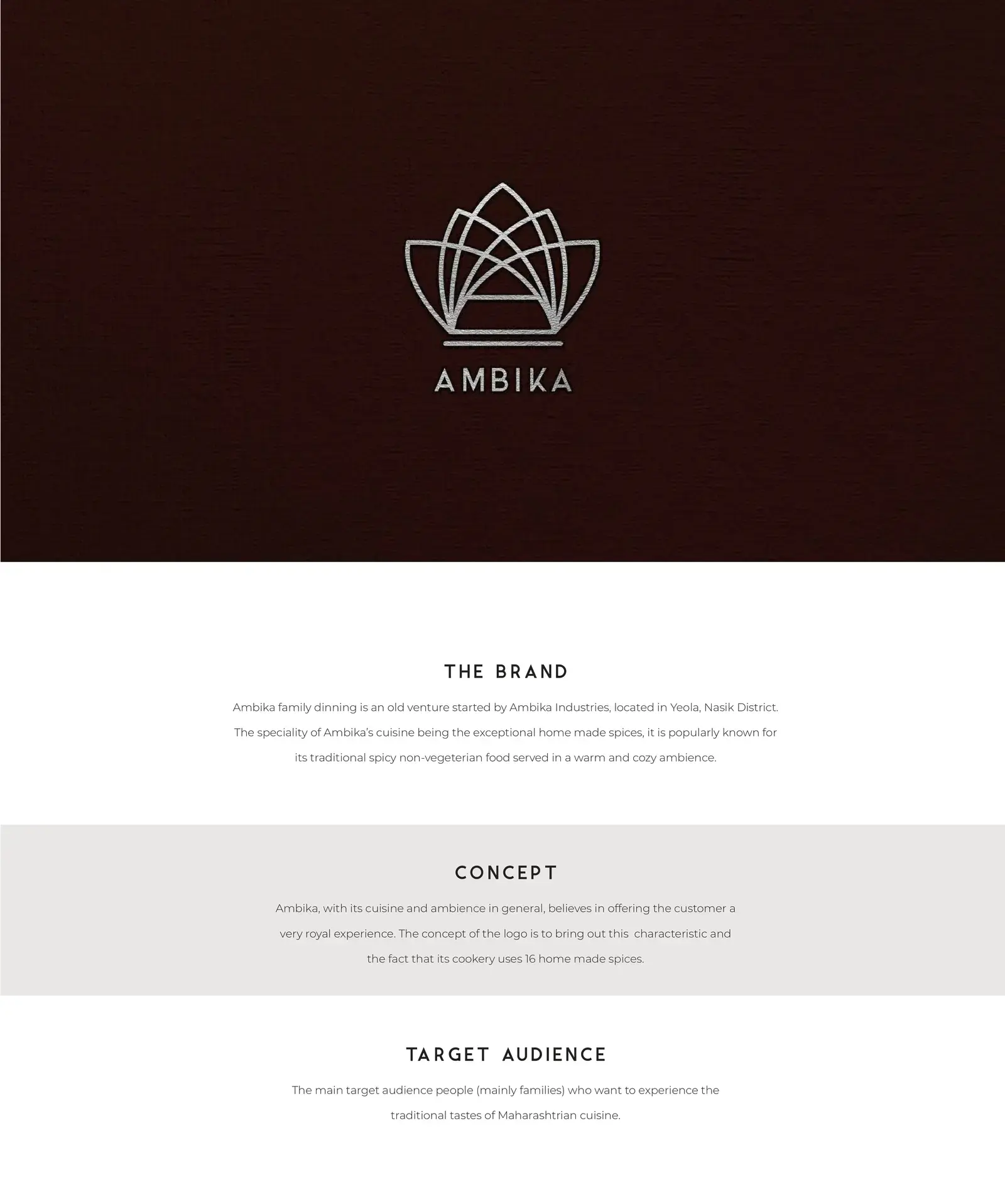
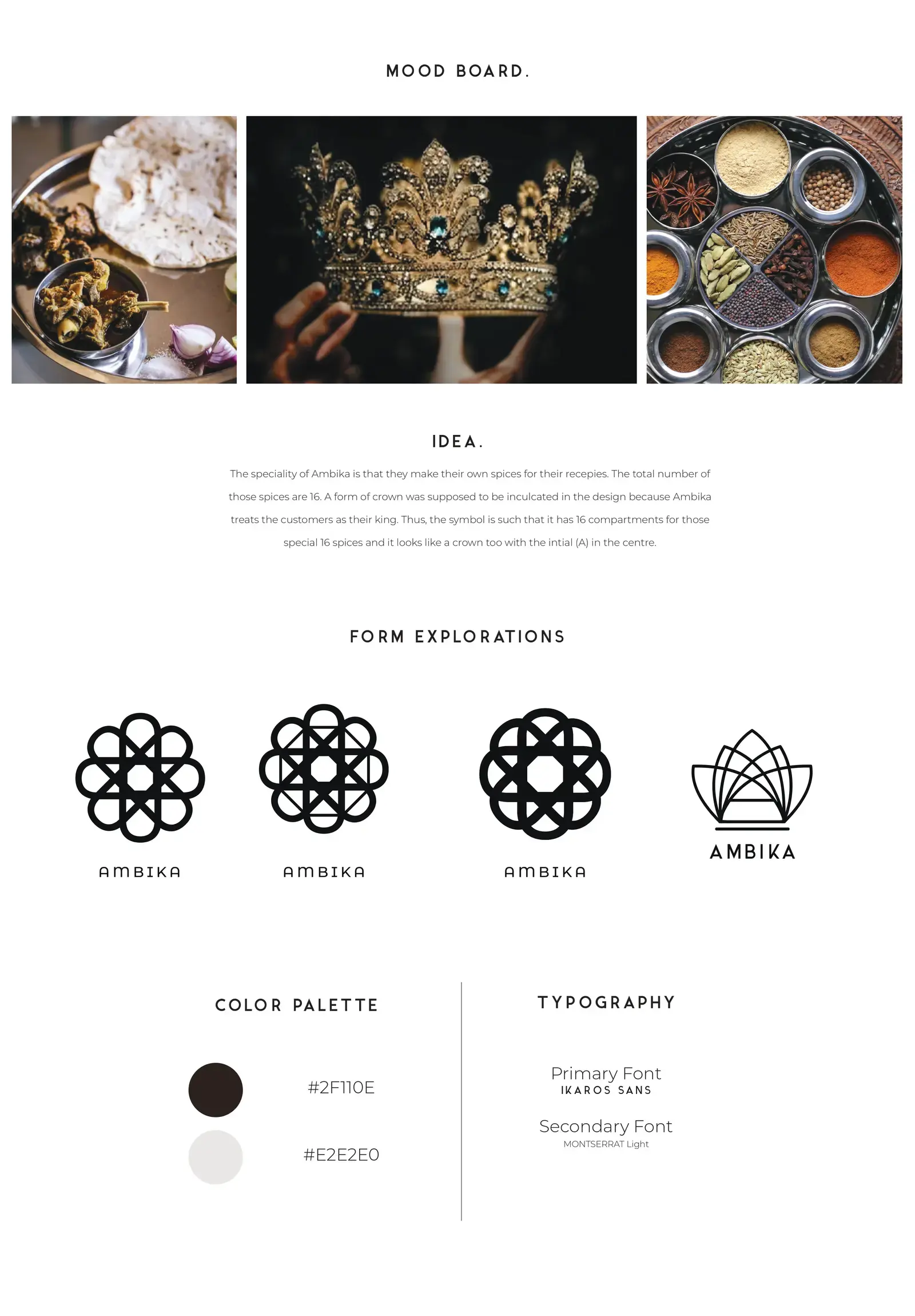
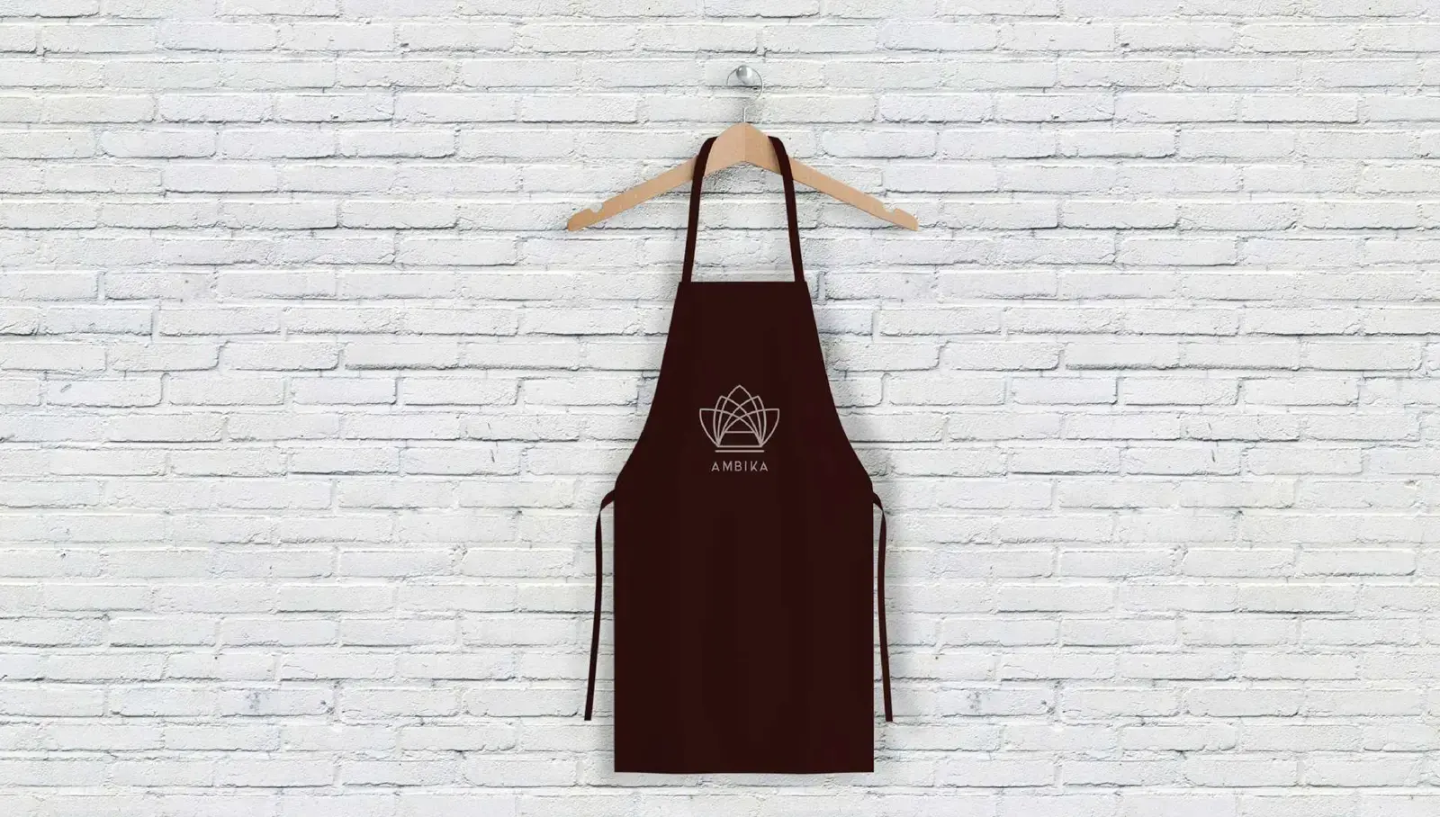
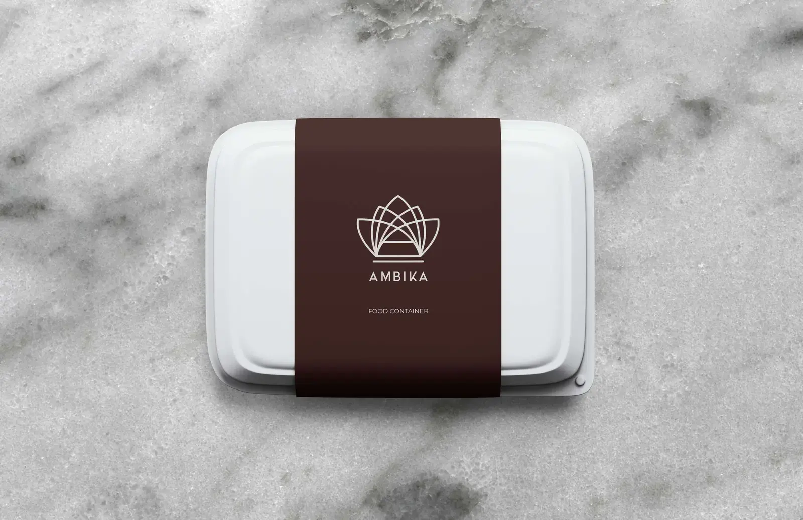
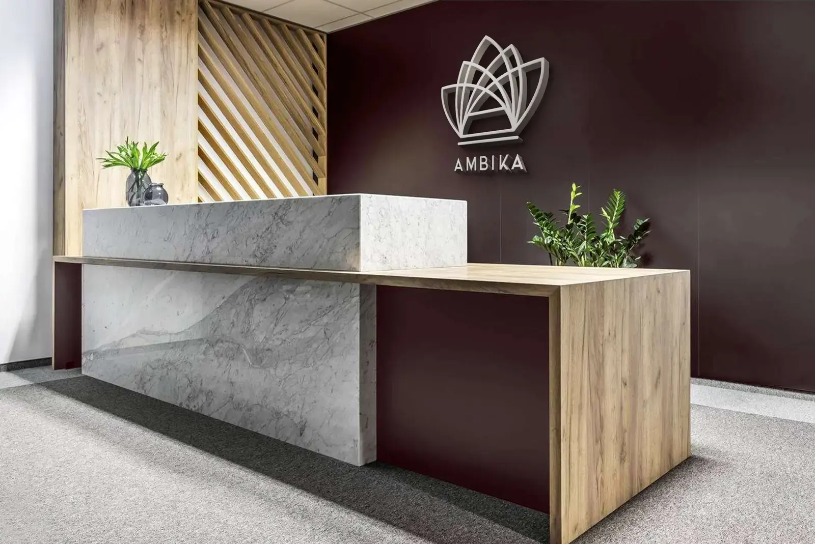
Created in 2020 for Ambika Family Dining, an established Ambika Industries venture in Yeola, Nashik district, this redesign brings a refined visual system to the hospitality brand. A linear geometric emblem, deep oxblood palette and restrained typography extend across stationery, staff clothing, takeaway packaging, tactile details and the reception environment.

Year
2020
01A redesigned identity grounded in hospitality and place
Complete Ambika brand story board with the primary emblem and project contextComplete Ambika moodboard, mark explorations, palette and typography board
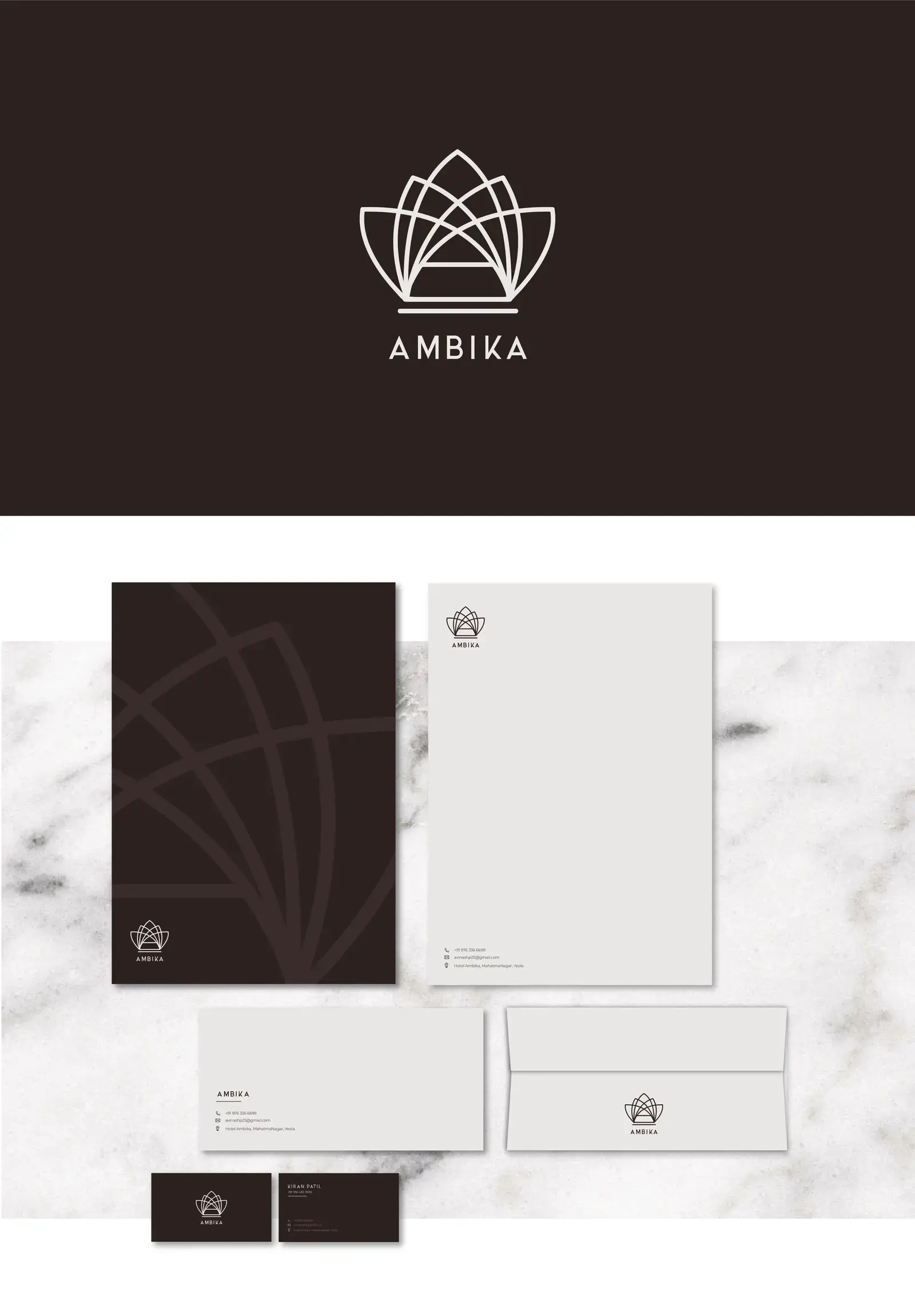
02The primary system moving from mark to stationery
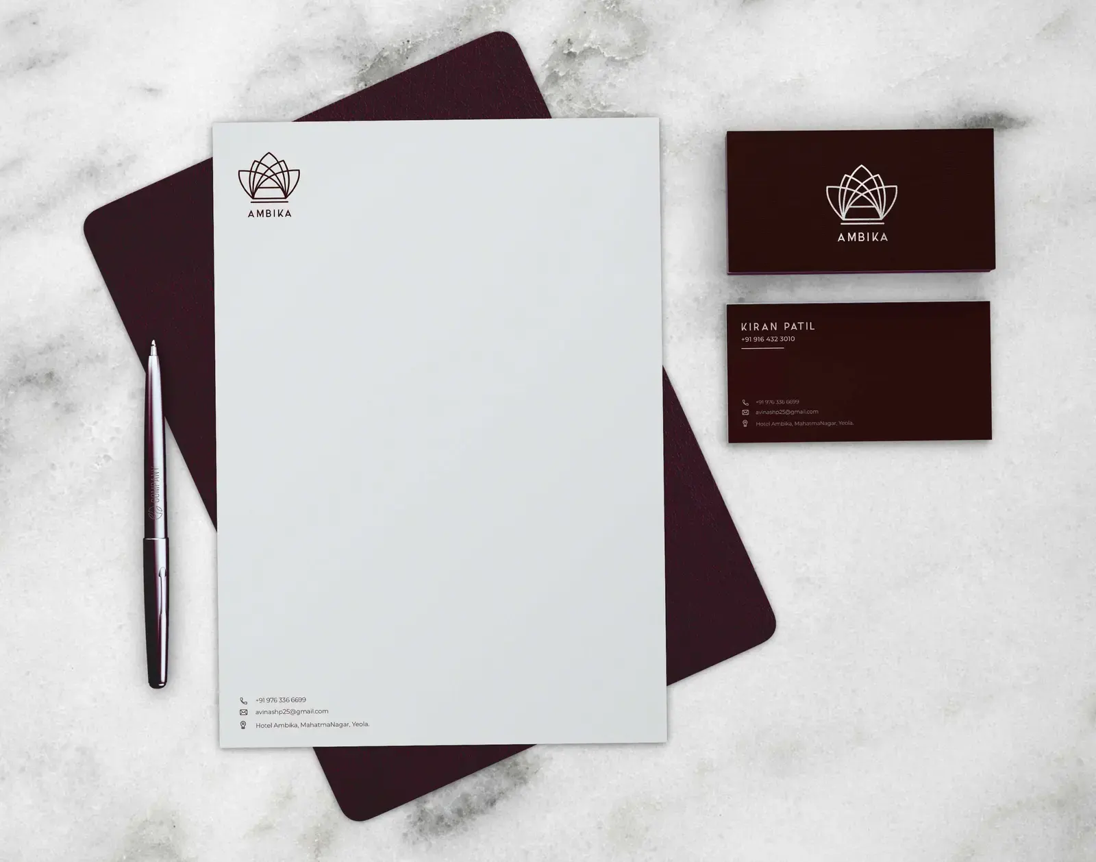
Complete Ambika primary identity and stationery presentation boardAmbika letterhead and business cards arranged on pale stone
03A consistent presence across service touchpoints
Deep oxblood Ambika service apron displayed against a white brick wallAmbika takeaway container wrapped with a deep oxblood brand sleeve
04Tactile details carried into the physical environment
Ambika geometric emblem pressed into a grey wax sealAmbika emblem mounted behind a stone and timber restaurant reception desk

KartenLabs / Contact

Tell us about your project.

We use these details only to reply to your enquiry, not for marketing. See our Privacy & Legal notice.